In graphic design, every element tells a story. Whether it’s a headline, an image, or a button, each piece has a role in guiding the viewer’s attention. This is where visual hierarchy comes into play—a powerful design principle that helps organize and prioritize information to create a clear and compelling message. Understanding and applying visual hierarchy ensures your designs don’t just look good but also communicate effectively.
What is Visual Hierarchy?
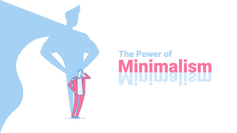
Visual hierarchy refers to the arrangement of design elements in order of importance. By using size, color, contrast, alignment, and other design principles, you can direct the viewer’s eyes to the most critical parts of your design. It’s the difference between a design that feels chaotic and one that feels intuitive.
Why is Visual Hierarchy Important?
- Guides the Viewer’s Attention
A strong visual hierarchy ensures that viewers notice the most important elements first, such as a headline or call-to-action (CTA). - Improves Readability
Properly prioritized content is easier to read and understand, enhancing the user experience. - Boosts Engagement
When viewers can quickly grasp the key message, they’re more likely to stay engaged with the design. - Supports Branding
Hierarchical designs reinforce brand identity by ensuring logos, taglines, or brand colors stand out appropriately.
Key Principles of Visual Hierarchy
To create a strong visual hierarchy, designers can use several techniques:
1. Size and Scale
- Larger elements naturally draw more attention. Use size to emphasize key content, such as headings or important images.
- Maintain proportionate scaling to ensure balance.
2. Color and Contrast
- Bright or bold colors can highlight essential elements, while muted tones recede into the background.
- High contrast between text and background improves readability and focus.
3. Typography
- Use font size and weight to create a clear distinction between headings, subheadings, and body text.
- Limit the number of fonts to maintain consistency and avoid confusion.
4. Alignment and Positioning
- Position key elements in areas where the viewer’s eyes naturally go, such as the top or center of a page.
- Use alignment to create a sense of order and structure.
5. Negative Space (White Space)
- Negative space allows elements to breathe and prevents a cluttered look.
- It draws attention to the focal points by reducing distractions.
6. Visual Flow and Direction
- Design with a natural reading pattern in mind, such as left-to-right and top-to-bottom in most cultures.
- Use lines, arrows, or other directional cues to guide viewers’ eyes.
Examples of Visual Hierarchy in Action
1. Websites
- On a landing page, the headline is often the largest text, followed by a subheading, and then a clear CTA button in a contrasting color.
- Amazon’s product pages highlight product titles, prices, and “Buy Now” buttons to guide purchasing decisions.
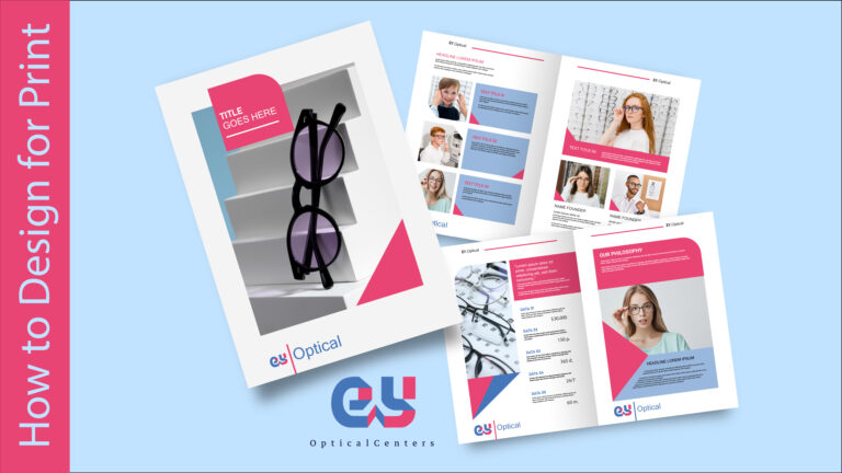
2. Print Media
- A poster might have a large, bold event name at the top, a prominent date and time in the middle, and additional details in smaller text below.
- Newspapers use bold headlines and subheads to prioritize breaking news over other stories.
3. Mobile Apps
- Apps like Instagram prioritize images and videos in the feed, with minimal distractions to focus on content.
- Navigation icons are often placed at the bottom, easily accessible to the user’s thumb.
How to Apply Visual Hierarchy in Your Designs
- Define Your Goal
Start by identifying the main message or action you want to communicate. - Plan Your Layout
Sketch a wireframe to determine the placement and size of key elements. - Use Contrast Thoughtfully
Apply color and size contrasts to emphasize important elements without overwhelming the design. - Test and Iterate
Get feedback to see if viewers interpret your design as intended. Adjust the hierarchy based on their reactions. - Stay Consistent
Maintain a consistent hierarchy across all related designs to strengthen brand recognition and usability.
Conclusion
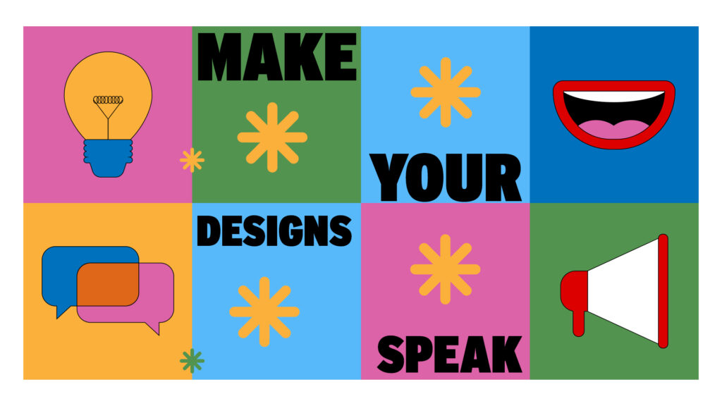
Visual hierarchy is the cornerstone of effective design. It’s not just about making things look good—it’s about ensuring your designs speak. By organizing and prioritizing elements thoughtfully, you can craft designs that are both visually appealing and highly communicative.
Whether you’re creating a website, a flyer, or a social media post, mastering visual hierarchy will set your designs apart. Start applying these principles today and watch as your work becomes more engaging and impactful.
Need help optimizing your designs with visual hierarchy? Weditt’s experts are here to assist!