Choosing the right colors for your brand is one of the most important decisions you’ll make in establishing your brand identity. Colors have a powerful impact on how people perceive your brand, and they can evoke specific emotions and associations that influence consumer behavior. In this guide, we’ll walk you through the process of choosing your brand colors, and we’ll provide examples to help you make the best decision for your business.
Understanding the Psychology of Color
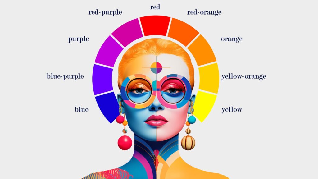
Before diving into the color selection process, it’s essential to understand the psychology of color. Different colors can evoke different emotions and associations, which can have a significant impact on how your brand is perceived. Here’s a brief overview of some common color associations:
- Red: Passion, excitement, energy, and urgency. Often used by brands looking to create a sense of excitement or urgency.
- Blue: Trust, reliability, calmness, and professionalism. Popular among brands that want to convey stability and dependability.
- Yellow: Happiness, optimism, warmth, and creativity. Ideal for brands that want to be seen as cheerful and friendly.
- Green: Growth, health, nature, and tranquility. Often used by brands related to wellness, the environment, or organic products.
- Purple: Luxury, creativity, wisdom, and sophistication. Commonly used by brands that want to appear high-end or imaginative.
- Orange: Enthusiasm, energy, playfulness, and affordability. Suitable for brands targeting a younger, more vibrant audience.
- Black: Power, elegance, sophistication, and formality. Often used by luxury brands to convey exclusivity.
- White: Simplicity, purity, cleanliness, and neutrality. Ideal for minimalist or modern brands.
Steps to Choosing Your Brand Colors
- Identify Your Brand Personality
Your brand personality is the set of human characteristics associated with your brand. Are you playful and fun, or are you serious and professional? Do you want to be seen as innovative and cutting-edge, or classic and timeless? Understanding your brand personality is the first step in choosing colors that align with your brand’s identity.
Example: If your brand personality is youthful and energetic, you might lean toward bright and vibrant colors like orange and yellow. On the other hand, if your brand is more sophisticated and luxurious, you might choose a color palette that includes deep purples or blacks.
- Consider Your Target Audience
The colors you choose should resonate with your target audience. Different demographics may have different color preferences and associations. For example, younger audiences might prefer bold, bright colors, while an older demographic might favor more subdued tones.
Example: A brand targeting young adults, like a trendy fashion retailer, might choose bold and vibrant colors like electric blue or hot pink. In contrast, a financial services company targeting older professionals might opt for more traditional colors like navy blue or forest green to convey trust and reliability.
- Analyze Your Competitors
Take a look at what colors your competitors are using. While you don’t want to copy them, it’s helpful to understand the landscape so you can choose colors that help your brand stand out. If most of your competitors use blue, for example, you might consider a different color that still aligns with your brand values but differentiates you in the market.
Example: If you’re launching a tech startup in an industry where blue is the dominant color (often associated with trust and technology), you might choose a unique color like teal or lime green to stand out while still conveying innovation.
- Choose a Primary Color
Your primary color will be the most recognizable and dominant color in your brand palette. It should reflect the core of your brand’s personality and be used consistently across all brand materials.

Example: Coca-Cola’s primary color is red, symbolizing excitement, energy, and passion. This color is instantly recognizable and consistently used across all of Coca-Cola’s branding.
- Select Secondary and Accent Colors
Once you’ve chosen your primary color, you’ll need to select secondary and accent colors to complete your palette. These colors should complement your primary color and add depth to your brand’s visual identity. Secondary colors are often used in backgrounds, while accent colors can be used for calls-to-action or highlighting important information.
Example: For a wellness brand, you might choose green as your primary color to represent health and nature. You could then select a soft beige as a secondary color for backgrounds and a vibrant orange as an accent color to draw attention to important elements like buttons or key information.
- Test Your Color Palette
Before finalizing your color palette, it’s essential to test it across different mediums and contexts. Make sure your colors work well together and are legible in various formats, such as digital screens, print materials, and signage. Consider how your colors will look in both light and dark environments.
Example: If you’re creating a logo with your chosen colors, test it on different backgrounds (white, black, colored) to ensure it remains visible and effective. You might find that your colors look great on a website but need adjustments for print materials.
Examples of Successful Brand Color Choices
- Spotify: Spotify uses a vibrant green as its primary color, symbolizing growth, energy, and freshness. This color stands out in the digital music streaming space and is easily recognizable across all platforms.
- McDonald’s: McDonald’s uses red and yellow in its branding, colors that evoke feelings of hunger, excitement, and warmth. The combination is effective in attracting customers and creating a sense of urgency to eat.
- Tiffany & Co.: Tiffany’s signature robin’s egg blue is synonymous with luxury, elegance, and timelessness. This unique color sets Tiffany apart from other luxury brands and is instantly associated with the brand’s high-end jewelry.