In the age of digital marketing, print design remains a powerful tool for reaching audiences in a tangible, impactful way. Whether you’re creating flyers, posters, or brochures, designing for print requires a unique set of considerations to ensure your materials look professional and convey your message effectively. Here are some essential tips to help you craft print designs that stand out.
1. Understand the Print Specifications
Before you start designing, it’s crucial to understand the technical requirements for print.
- Resolution: Ensure your images are at least 300 DPI (dots per inch) for high-quality printing.
- Bleed Area: Extend your design beyond the trim lines (usually 3-5 mm) to avoid white edges after cutting.
- Color Mode: Use CMYK (Cyan, Magenta, Yellow, Black) instead of RGB, as CMYK is standard for printing.
- File Format: Save your final design as a PDF, ensuring all fonts and images are embedded.
2. Plan Your Layout Carefully
An effective layout guides the viewer’s eyes and organizes content for easy comprehension.
- Hierarchy: Prioritize elements like headlines, images, and calls-to-action using size and placement.
- Grid Systems: Use grids to align text and images consistently, creating a clean and professional look.
- White Space: Don’t overcrowd your design. White space helps emphasize key elements and improves readability.
3. Choose the Right Typography
Typography plays a significant role in setting the tone and ensuring readability.
- Font Pairing: Use two or three complementary fonts—one for headings, one for body text, and an optional accent font.
- Readability: Opt for clean, legible fonts and avoid overly decorative styles for large blocks of text.
- Size: Ensure text sizes are appropriate for the distance at which the material will be viewed. For example, posters require larger text than brochures.
4. Use Colors Wisely
Colors in print can look different from what you see on your screen.
- Proofing: Always test your colors with a physical proof before final printing.
- Contrast: Use high-contrast color combinations to make your design pop and ensure text readability.
- Brand Colors: Incorporate your brand’s color palette to maintain consistency and reinforce identity.
5. Include High-Quality Images and Graphics
Blurry or pixelated images can ruin the professionalism of your design.
- Resolution: Use images with a resolution of 300 DPI or higher.
- Vector Graphics: For logos and illustrations, use vector files (e.g., AI or SVG) to maintain quality at any size.
- Compression: If using photos, avoid excessive compression, which can reduce quality.
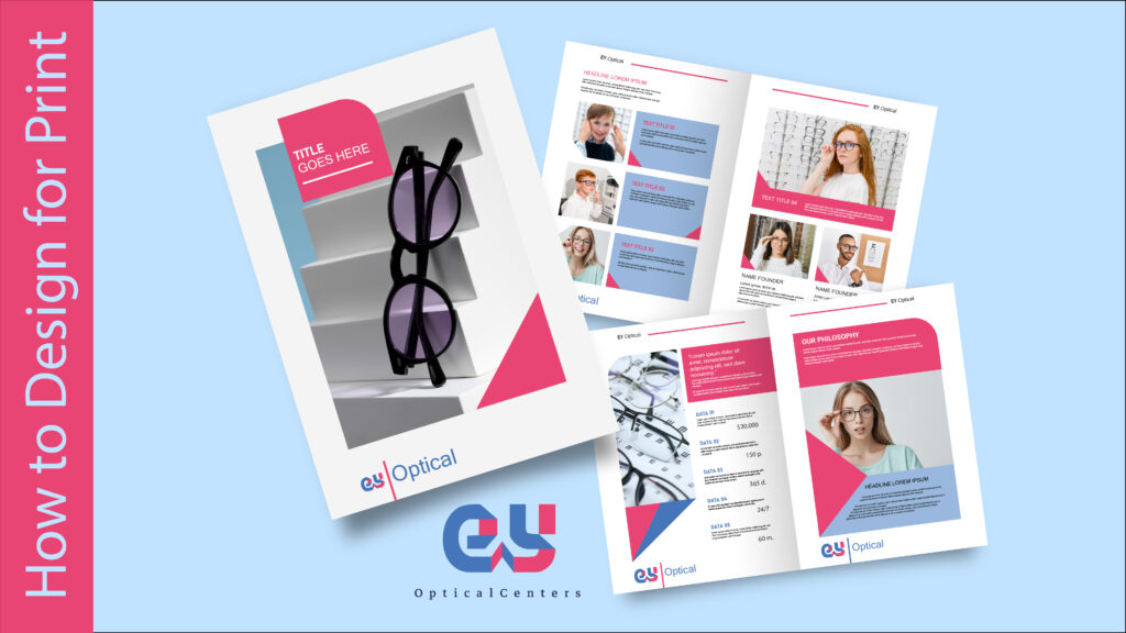
6. Tailor Your Design to the Format
Flyers, posters, and brochures each have unique design requirements:
- Flyers: Keep the content simple and direct. Use bold headings and minimal text to grab attention quickly.
- Posters: Prioritize visual impact with large images or bold typography. Ensure the key message is readable from a distance.
- Brochures: Organize content into sections or panels with clear headings, and use consistent design elements throughout.
7. Proofread Thoroughly
Errors in print can be costly to fix and damage your credibility.
- Double-check all text for spelling, grammar, and punctuation errors.
- Ensure all contact information, dates, and URLs are accurate.
- Review alignment, spacing, and formatting to catch any inconsistencies.
8. Work with a Professional Printer
Collaborating with a reliable printing service ensures your design comes to life as intended.
- Discuss Materials: Choose the right paper type and finish (e.g., matte, glossy) for your project.
- Request Proofs: Review physical or digital proofs to ensure colors, alignment, and quality meet your expectations.
- Communicate Clearly: Share your specifications, including bleed, crop marks, and any special finishing requirements.
9. Incorporate a Call-to-Action (CTA)
Every print material should encourage the audience to take action.
- Use clear, actionable language like “Call Now,” “Visit Our Website,” or “Join Us Today.”
- Make contact details easy to find, including phone numbers, email addresses, or QR codes for digital links.
Conclusion
Designing for print requires attention to detail and a strong understanding of the medium. By following these tips, you can create flyers, posters, and brochures that not only look stunning but also effectively communicate your message.
Need expert help designing print materials? Weditt specializes in creating print-ready designs that make an impact. Contact us today to bring your vision to life!