The Principles of Design are fundamental rules guiding how visual elements (like line, shape, color, space) are arranged to create clear, effective, and aesthetically pleasing communication, focusing on concepts like Balance, Contrast, Emphasis, Repetition, Alignment, Proximity, and Unity to organize visuals, direct the eye, and ensure a coherent message for the audience, turning raw elements into impactful designs.
1. Balance
Balance refers to the distribution of visual weight within a design. It provides stability and structure to a composition. There are two primary types of balance:

- Symmetrical Balance: This occurs when elements are evenly distributed around a central axis, creating a mirror image. Symmetrical designs are often perceived as formal, organized, and harmonious.
- Asymmetrical Balance: This involves the uneven distribution of elements, yet still achieving a sense of balance. Asymmetrical designs can be dynamic and interesting, offering a sense of movement and energy.
2. Contrast
Contrast is the principle of highlighting differences between elements to create visual interest and focal points. Effective use of contrast can make a design more engaging and easier to navigate. Contrast can be achieved through variations in color, size, shape, texture, and typography. For instance, a bold, dark headline against a light background immediately draws attention.
3. Emphasis
Emphasis involves making certain elements stand out within a design to draw the viewer’s attention. This can be achieved through the use of contrast, color, size, and placement. By emphasizing key elements, a designer can guide the viewer’s eye and communicate the most important aspects of the message. For example, a call-to-action button on a website might be designed in a bright color to attract clicks.
4. Unity (Harmony)
Unity, or harmony, ensures that all elements in a design work together cohesively, creating a sense of completeness and consistency. Achieving unity involves using similar colors, shapes, textures, and themes. When elements are visually connected, the overall design feels more organized and polished. Unity helps in making complex designs more understandable and aesthetically pleasing.
5. Proportion
Proportion refers to the relative size and scale of various elements within a design. Proper proportion helps create a sense of harmony and balance. It ensures that each element is appropriately sized in relation to the others, maintaining visual coherence. For instance, in a poster design, the main headline should be proportionally larger than the body text to indicate its importance.
6. Movement
Movement guides the viewer’s eye through the design in a deliberate way, creating a sense of action or direction. This can be achieved through the use of lines, shapes, and the strategic arrangement of elements. Movement helps lead the viewer from one part of the design to another, ensuring that the intended message is effectively communicated. For example, diagonal lines and arrows can direct attention towards a specific area.
7. Rhythm
Rhythm creates a sense of organized movement within a design through the repetition of elements such as lines, shapes, or colors. This repetition can establish patterns and textures that enhance the overall composition. Rhythm can be regular, flowing, or progressive, each bringing a different dynamic to the design. A well-implemented rhythm can create visual interest and maintain viewer engagement.
8. Pattern
Pattern involves the repetition of elements in a consistent and regular arrangement. Patterns can add visual interest, texture, and depth to a design. They can be used as backgrounds, borders, or to fill specific areas within a composition. Patterns can be simple or complex, and they help in creating a cohesive look across different design elements.
9. Variety
Variety is the use of different elements to create visual interest and prevent monotony. By incorporating various shapes, colors, textures, and sizes, a designer can keep a composition dynamic and engaging. While unity ensures coherence, variety adds excitement and prevents the design from becoming dull. Balancing unity and variety is key to creating an interesting yet cohesive design.
10. Space
Space, also known as negative space, is the empty area around and between elements in a design. Effective use of space can help define shapes, improve readability, and create a sense of balance and harmony. Space can be used strategically to highlight important elements and prevent a design from feeling cluttered. For example, ample white space around a logo can make it stand out more prominently.
11. Alignment
Alignment refers to the placement of elements so that they line up along common edges or centers. Proper alignment creates order, organization, and visual connections between elements. It ensures that no element feels out of place and everything appears intentional. Alignment can be used to create clean, structured designs that are easy to follow.
12. Repetition
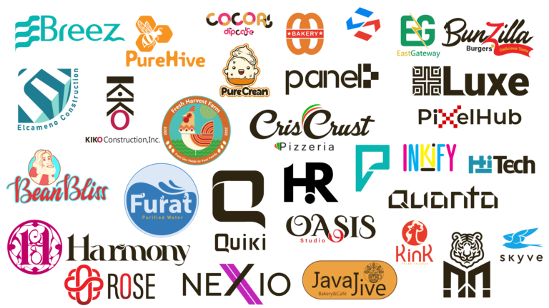
Repetition involves using the same element or style consistently throughout a design to create a cohesive and unified look. Repetition can reinforce a message and make a design more memorable. It helps in establishing a visual language that the audience can recognize and relate to. For instance, repeating a specific color scheme or typography style across a brand’s materials helps in creating a strong brand identity.