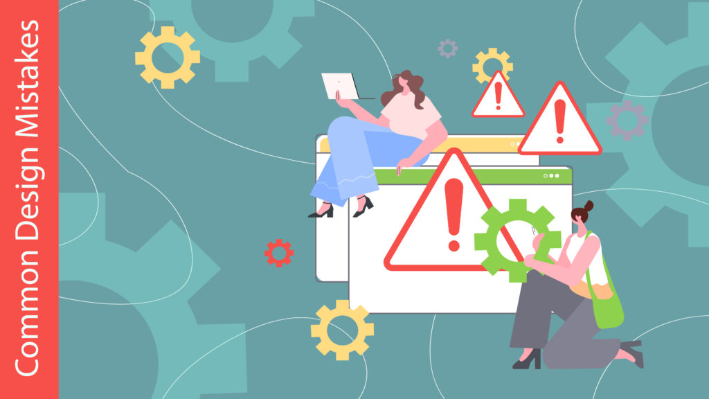
Great design is about more than aesthetics—it’s about communication, usability, and impact. However, even seasoned designers can fall into common pitfalls that undermine their work. By identifying these mistakes and learning how to avoid them, you can create designs that are not only visually appealing but also effective in achieving their purpose.
1. Overloading the Design with Elements
The Mistake:
Trying to include too many elements in a design can make it feel cluttered and overwhelming. This often happens when designers attempt to convey too much information at once or fail to prioritize elements.
Why It’s a Problem:
A busy design confuses the viewer, making it difficult to focus on the key message.
How to Avoid It:
- Use negative space to balance your design and give elements room to breathe.
- Focus on simplicity: Only include elements that add value to the overall message.
- Prioritize the most important information and organize it using visual hierarchy.
2. Poor Typography Choices
The Mistake:
Using too many fonts, inappropriate typefaces, or illegible text can make your design look unprofessional and hard to read.
Why It’s a Problem:
Typography directly impacts the readability and tone of your design. Poor font choices can distract from the message or make it harder to understand.
How to Avoid It:
- Limit your design to two or three complementary fonts.
- Ensure your text is legible, with sufficient contrast against the background.
- Choose typefaces that match the tone of the design. For example, use sans-serif fonts for modern designs and serif fonts for formal or classic looks.
3. Ignoring Color Harmony
The Mistake:
Using clashing colors or neglecting to consider the emotional impact of your color palette can hurt your design’s effectiveness.
Why It’s a Problem:
Colors evoke emotions and play a crucial role in how viewers perceive your design. Poor color choices can create confusion or discomfort.
How to Avoid It:
- Use a color wheel to select harmonious colors. Consider complementary, analogous, or triadic color schemes.
- Keep contrast in mind to ensure readability and focus.
- Research the psychology of color to align your palette with the design’s purpose.
4. Not Designing for the Intended Audience
The Mistake:
Creating a design that appeals to the designer’s preferences rather than the target audience can result in missed connections.
Why It’s a Problem:
Designs that fail to resonate with the intended audience are less effective, regardless of how aesthetically pleasing they are.
How to Avoid It:
- Conduct research to understand your audience’s preferences, behaviors, and expectations.
- Tailor your design’s style, tone, and content to meet the needs of your target audience.
- Test your design with a sample of the audience for feedback.
5. Neglecting Responsiveness and Scalability
The Mistake:
Designs that don’t adapt well to different screen sizes, resolutions, or printing requirements risk losing their effectiveness in certain contexts.
Why It’s a Problem:
Inconsistent or poorly scaled designs can appear distorted, unprofessional, or difficult to engage with.
How to Avoid It:
- Design with scalability in mind, ensuring all elements look good at various sizes.
- Use vector graphics for logos and illustrations to maintain quality at any resolution.
- Test your designs across different devices, platforms, and formats to ensure they remain effective.
Conclusion
Mistakes are part of the learning process, but by recognizing these common design pitfalls, you can take proactive steps to avoid them. Focus on clarity, simplicity, and alignment with your audience’s needs to create designs that not only look good but also deliver results.
At Weditt, we help you sidestep these design challenges and craft visuals that truly stand out. Let’s create something exceptional together!